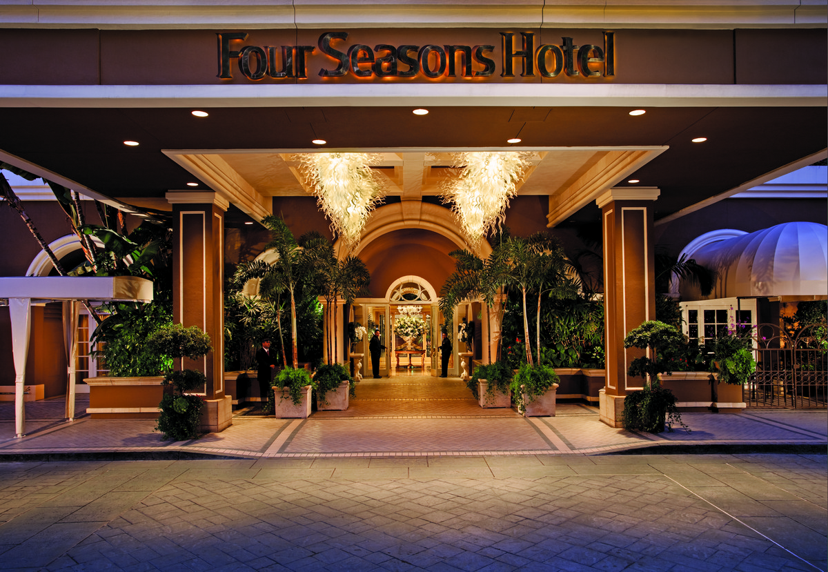
Four Seasons Hotels & Resorts
THE STORY: A case study of the conceptual redesign of the Four Seasons hotel website.
THE REDESIGN
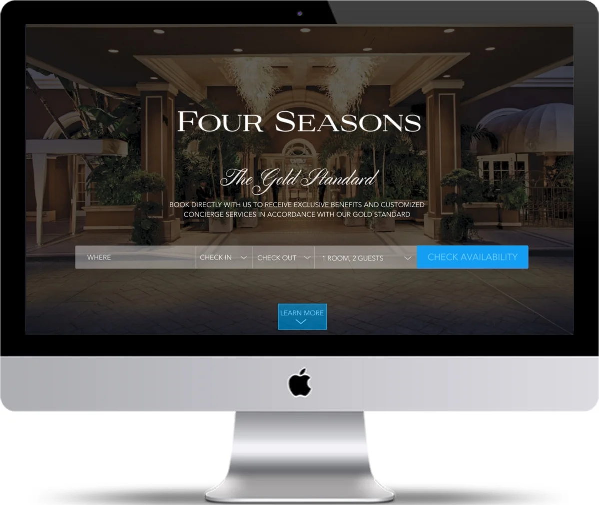
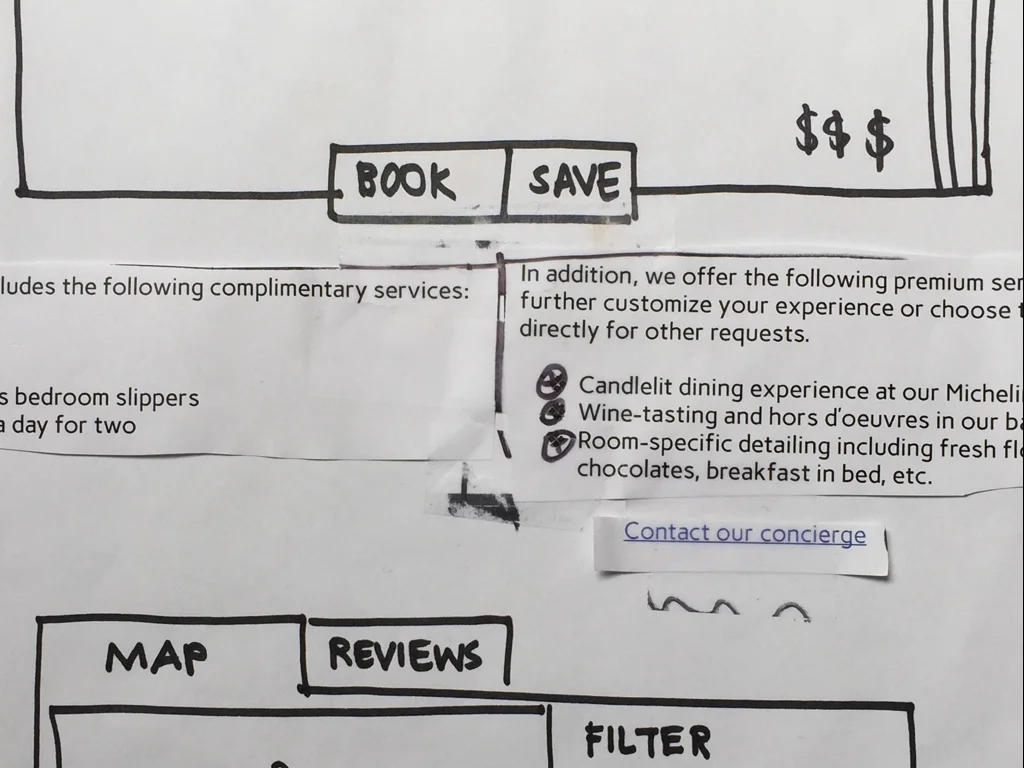
We wanted visitors to the Four Seasons website to immediately see the benefits of booking directly with the hotel. We combined the promise of excellent customer service and the additional value of direct-booking benefits into a package we called “The Gold Standard”. We kept the messaging for “The Gold Standard” clear and consistent throughout the booking process, allowing users to build excitement for their stay, customize their hotel experience with detailing like fresh flowers, wine-tasting or a candlelit dinner, etc. and remind them of the value they would be receiving for the purchase they made.
The Design Process
sCOPE
Duration: 2-week sprint
Team: 3 UX designers
Skills: Research, Sketching, Wireframing, Prototyping, Testing, Iterating, Interface design
Tools: Pen & paper, Sketch 3, InVision, Keynote
My role: Hands-on collaboration throughout design process with emphasis in user research and content strategy
THE PROBLEM
The Four Seasons hotel realized it was losing business to consumers using third-party booking sites (Kayak, Hotels.com, etc.) to book rooms in their hotel. They wanted to recapture some of this market by encouraging people to book with them directly. While their current site offered a price match guarantee, there were no additional incentives to book directly with the Four Seasons, versus another 5-star hotel, nor did the site offer the additional flexible features and comparisons that a third-party booking site did.
THE SOLUTION
Offer visitors of the website encouraging incentives and benefits as well as customizable options to book directly with the Four Seasons hotel and specifically tailor their stay.
KEY QUESTIONS
- What percentage of travelers are using third-party booking sites?
- What are their incentives for using third-party booking sites?
- Which devices are they using to book their travel plans?
Reasons for third-party booking
USER RESEARCH
We conducted a survey to find out the answers to our key questions. Here’s what we found:
- 53% traveled less than 3 times per year
- 89% used third-party booking sites
- 57% have previously booked a 5-star hotel
- 89% of users went to third-party booking sites for price comparison
- 82% of users used their desktop device to book their hotel accommodation
Based on these findings, we decided to:
- Create incentives for users to book directly with the Four Seasons hotel
- Assure visitors to the Four Season’s website that they were getting the best price
- Design for majority users by doing a responsive web redesign
We also conducted user interviews, during which interviewees recounted their experiences staying in 5-star hotels. Their stories spoke of luxury experiences and high-class affordances, of being catered to hand and foot by exceptional staff. It was clear that they walked away with valuable memories, which led us to believe that this redesign needed to sell the promise of an incredible experience.
PERSONA
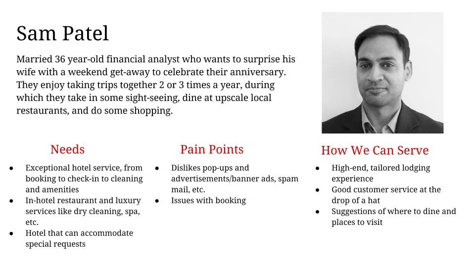
We created a persona based on the information we gained from the survey. Meet Sam Patel, a financial analyst who wants to surprise his wife with a weekend getaway at a 5-star hotel for their upcoming anniversary.
BRAND
Maintaining the brand of the Four Seasons during the redesign was very important to our team. As part of our research into this area, our team visited Four Seasons San Francisco and spoke with several guests. We discovered that they never used third-party sites for booking. They were long-term customers of the Four Seasons and had established such a strong of trust with the hotel, that they didn’t book using any other hotel or booking method. The Four Seasons had earned their loyalty.
COMPETITIVE ANALYSIS
We analyzed the features and offerings of 3 third-party booking sites, 2 luxury booking sites and 3 local 5-star hotels. As seen from the chart, they specialized in very different categories in terms of what they offered users. Third-party booking sites offered plenty in the way of price and amenity comparison, as well as flexible booking dates and add-ons like rental cars and tours, but were difficult to navigate to check-out and contained modals and advertisements. 5-star hotel sites offered a streamlined, aesthetically pleasing process to check-out, but didn’t offer the flexible features of third-party sites.
SKETCHING
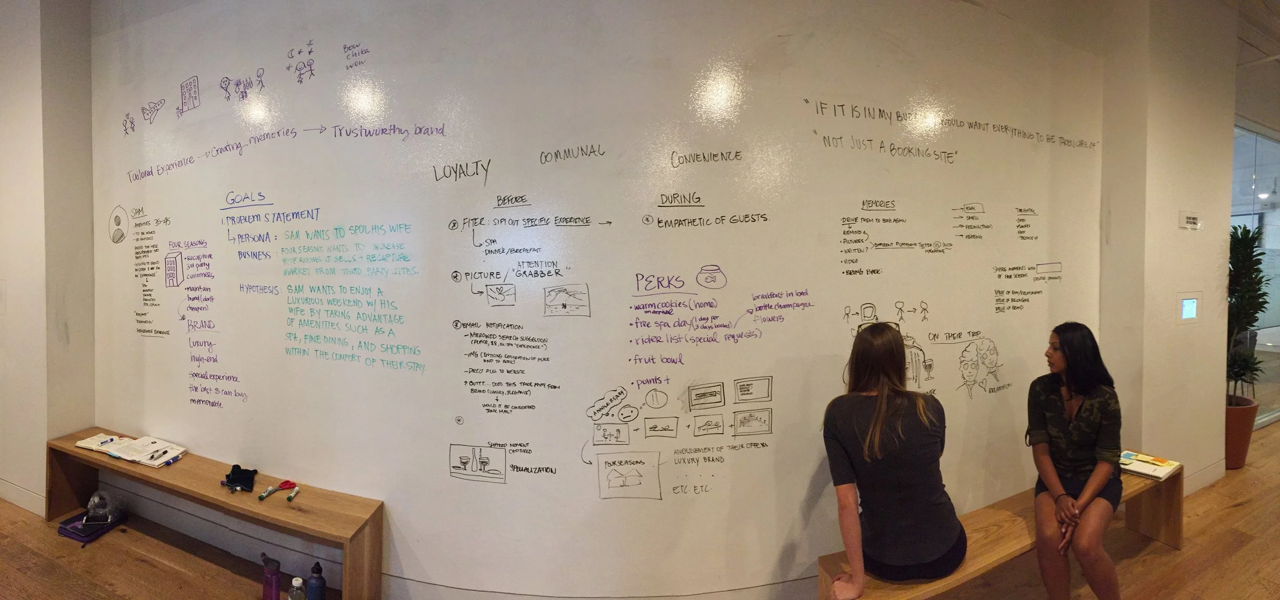
Our initial sketches included visual storyboards for experiences we felt travelers would find luxurious and memorable, words and phrases we associated with luxury services and many, many ideas for how we could help take Four Seasons to the next level. This was no easy feat, as this hotel already had everything from babysitting services to private jets for use. Some ideas we scrapped included wristbands that could summon concierge upon request, printed itineraries of hotel events and themed vacation packages that guests could order.
PAPER PROTOTYPING
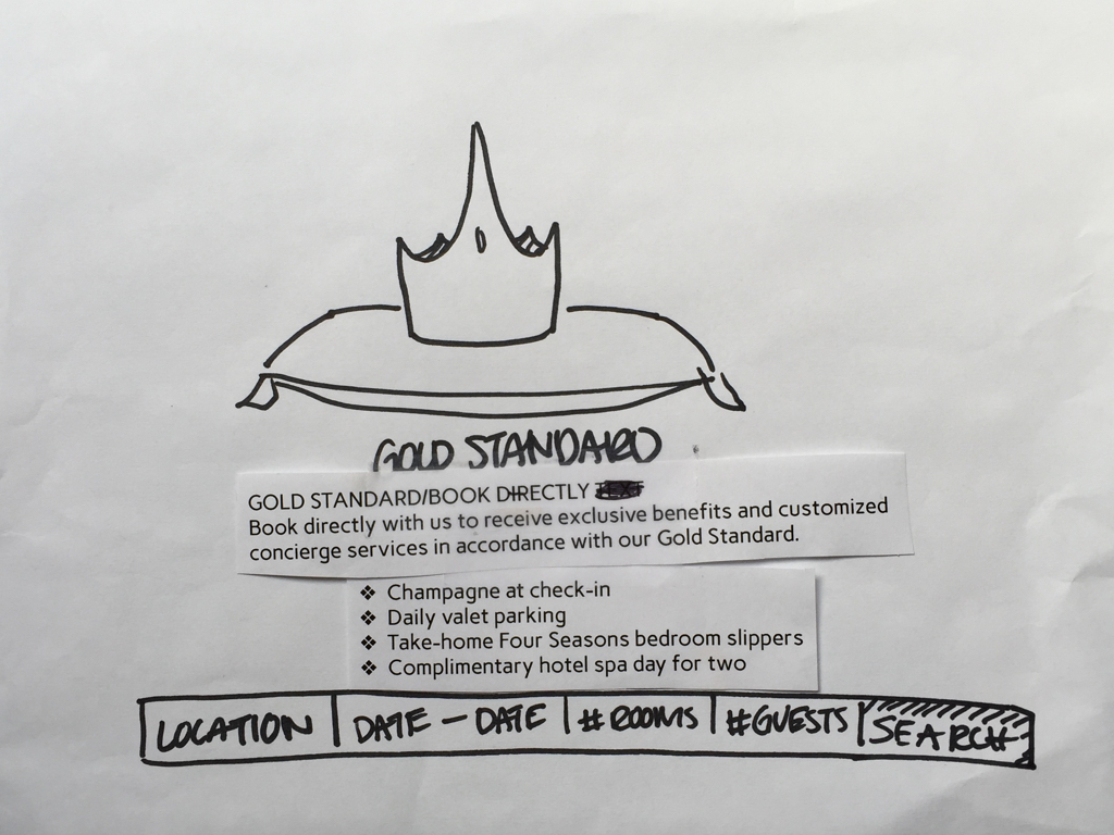
Paper prototyping taught us a great deal about which areas we needed to concentrate on. Initially, we focused heavily on the images in our prototype to showcase the luxury service we wanted to win users over with, but this wasn’t enough to encourage them to book directly. We realized that increasing the fidelity of our textual content would strengthen the message we were trying to send, and this change was met with positive feedback in testing.
WIREFRAMES
Our wireframes really helped us see where users expected to see call-to-action buttons, where they wanted to interact with the site more, and the order in which they wanted to receive information before booking a room. We made these changes and kept testing to ensure that the entire process was flowing smoothly during testing.
USABILITY TESTING
We ran tests by first asking our users to read through our persona and then visit the site. The majority of them responded well to the messaging we incorporated into the site encouraging users to book directly with the Four Seasons. They expressed excitement with featured benefits like champagne at check-in and complimentary spa visits and stated that they would prefer to book directly and receive these benefits than book through a third-party site.
Conclusion
OUTCOME
A redesigned website that contained strong, consistent messaging highlighting special incentives and benefits for booking directly while maintaining their renowned brand.
SUCCESS METRICS
Success can be measured upon the increase in percentage of direct bookings made on the Four Seasons website after redesign. Additionally, we measured the success of our redesign upon whether our users felt they were getting enough information out of the site, value for their money and built enough trust going through the site to book with the Four Seasons directly. Their positive feedback and excitement to experience the benefits of booking directly with the hotel led us to feel that we headed in the right direction with this project.

